Saturday 28 March 2020

Applied Animation: Documentary - Animatic and Characters

Applied Animation
Animatic and Character Sheets

  • This week:
    • I worked on the character sheets for Fenrir and Jormungandr and started to put the audio onto the animatic.
  • What went well:
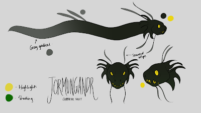
    • I was able to produce a simple character sheet for both Fenrir and Jormungandr, which fits the style we had decided for the documentary. The designs of both characters are simple, as we decided to opt for more intense shading and highlights. 
      • One thing I needed to change, however, was the colour gradients on the characters, as they would not completely work in Toom Boom, if we were to turn them into a puppet. This is why I made an additional character sheet, without the gradients if this doesn't work.
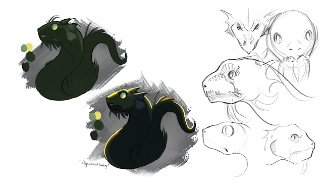
    • I additionally produced some expression sheets to explore ways the characters can express during the animation.


Expression Sheets:


    • In addition to this, I put together an animatic using Toon Boom Storyboard Pro, in order to understand the software. I had previously made notes on working in Storyboard Pro, as I had done so when a Professional came in to talk about it, last year, however I still looked at video tutorials on the Toon Boom website, to help.
    • One thing I noticed about the timing was that there were many held frames, which made the overall duration of our documentary longer. However, as these are held frames, we will be able to keep on top of this. 
Here is the animatic so far:


  • What could be improved:
    • The character sheets need to be fully explored and placed onto a background, to make sure that they don't blend in too much, but still fit within the "universe". This can be done by creating further concept art, similar to the style of Josephs' already produced backgrounds.
    • The animatic needs further development, with more audio and sound effects, which may need to acquired over time.
    • We have been actively trying to make changes to our Gantt Chart and schedule to make sure that we are able to produce something in good time. It's complicated at the moment, with the lockdown, however we are working through this.
  • Next week:
    • Ill be starting keyframes and finishing up the concepts and animatic.


Friday 27 March 2020

Professional Practise 2: Competitions - 11 Second Club

Professional Practise 2
11 Second Club Competition

  • This month, along with the Character Design Challenge, I wanted to try doing the 11 Second Club Competition, as I had a little bit of time to animate something. I decided to give myself a limit of three days to work on this, as I have a tendency to become too much of a perfectionist and want to keep working on something. This forced me to explore timing and focus more on the animation than the look of the character. Overall, despite being a competition, it was fun practise!
  • This months' audio clip was a section of a song from the movie and musical, Mamma Mia, so I was to animate a lip-sync. I wanted to explore subtle emotions and hand movements in this, rather than a lot of movement. I found it more difficult keeping the linework consistent with such small movements, but it was good practise and something I can focus on next time.
  • Here is the rough animation I did and the evidence:


Wednesday 25 March 2020

Professional Practise 2: Competitions

Professional Practise 2
Character Design Challenge: March

  • This months' theme for the character design challenge was Norse Gods. For the Applied Animation module, we are making a documentary on Norse Mythology, so I chose to draw a character which we had not explored within that module.
  • The character I chose was Freyja. She is the Goddess associated with love, beauty and fertility. She has a cloak made from Falcon feathers, which allows her to fly. I chose to focus on this in her design, drawing her from an angle showing her back, as the design challenge allows for illustrative designs. As I was limited on time for this competition, it wasn't as detailed or unique as I wanted it to be.
Here is the final illustration:


Here is the proof of submission to the Facebook group:


Tuesday 24 March 2020

Professional Practise 2: Presentation Feedback

Professional Practise 2
Presentation Feedback

  • Here are some points of feedback from Mike, about Studio Brief 3s' presentation:
    • Clear presentation, easy to read and follow.
    • Acknowledgement of specialisation, however something we'd find is making revenue through advertisement.
    • Cute, simple logo, works well - likes animal mascot friendly and cute.
    • Clear roles and positions represented.
    • Competitors sensible, especially as they produce similar content, however we need to be aware of the size of each studio, as Brown Bag has hundreds of staff, whereas we are a small company.
    • Good website, social media and online presence and consistency between everything.
    • Target Audience in the kinds of work were producing - the way TV is going with multi-channels, animation has broader appeal.
    • Might not need four licenses of Creative Cloud.
      • Make it clearer on website about advertising and short-form animation
    • Potential project in presentation is a good edition.

Saturday 21 March 2020

Professional Practise 2: Studio Brief 3 - Talk the Talk

Professional Practise 2
Final Studio Overview

  • As an overview of the work we have done for the studio brief, I decided to create this short description of everything as a whole:
    • Our studio is called Bobcat Studios.
    • Individually, I offer skills in 2D Animation, Concept Art and Background Design.
    • As a group, we offer short form 2D Animations, which are colourful and lively.
    • Our unique selling point is are individuality, providing a variety of animated work, such as both entertainment and educational. In addition to this, our openness to experiment to appeal to an older market.
    • Our target market are companies looking for studios to work predominantly towards the age group 11-16 years, however we would be willing to produce work for up to 18, if it consists of mild violence or gore.
    • The financial costs to keep in mind will be for the up-keep of a studio space and the resources, such as costing for equipment and software.
    • Our work is promoted through social media and online marketing, such as our own website and Instagram.

Professional Practise 2: Studio Brief 3 - Presentation

Professional Practise 2
Presentation Recording

  • For both practise and also to help evaluate my own strengths and weaknesses with presenting, we decided to voice record and video record our presentation. This also became very helpful when the University needed to close because of the virus pandemic.
  • We started by producing a quick recording of our voices, reading over our scripts. I felt this was forced in some places and didn't fully allow me to practise actually presenting and not reading from a script. I noticed that a lot of the times I paused, or lost my train of thought was because of nerves or stumbling over my words and having to try re-phrase or repeat the sentence. I think this will become better with more practise.
    • Despite this, I found that I was clear in the way I spoke and positioned myself, which had gotten a lot better from when I first presented.
Here is the presentation:


Here are both of the recordings:


Friday 20 March 2020

Applied Animation: Documentary - Developing Script and Concepts

Applied Animation
Documentary Development

  • This week:
    • I developed the pre-production phase of the documentary, by exploring further research, editing the script, producing a rough storyboard and working on feedback from my initial concepts.
  • What went well:
    • As I was struggling to cut down the word-count of the script, I contacted Mat to help out with what was needed and what could be cut out. He assisted me in developing the script, to make it more understandable to those who don't have a full understanding of the story. 
    • Here is the second draft that we came up with:

  • Furthermore, using this script, I was then able to produce the rough storyboard, which Caitlin will then refine digitally. Using post-it notes was the easiest way to do this, as it gave me a lot of room to move things around or add more shots in to tell the story.


  • Finally, I produced some further character concepts, this week, in order to develop the concepts I explored last week. One of the feedbacks we received was that we needed to develop the characters to appeal more to a teenage audience, making them visually darker and less "rounded". This was something I explored with Fenrir, making his fur more angular and then developing the eel idea with the serpent. I think these turned out better.
Last weeks designs:

Improved Designs:


Fenrir Concept:

  • What could be improved:
    • The characters still need development and I still need to design some concepts for Hel. Caitlin will be working on Hels' design and Joseph is working on the backgrounds, however I would like to explore some concepts regarding this, for the characters and backgrounds.
    • The script still needs some development, as it is not fully proof-read yet and I need to look back on previous research to see how this can be improved.
    • The final character sheets need to be produced, which are flat-coloured and explain exactly how the highlights and shading will be done. Using one flat-colour for each of the characters means that we can add shading and highlights more easily when animating.
  • Next week:
    • Ill be finalising pre-production work and planning a work-flow whilst everyone is working from home.


Wednesday 18 March 2020

Applied Animation: Competition - Final Submission

Applied Animation
Final Entry for the Competition

  • This week:
    • We submitted the final presentation for the Audible Competition!
  • What went well overall:
    • We were able to submit our entry in good time!
    • We were able to deliver an idea to Audible, that is both professional and hits each element requested in the brief.
      • The idea targets 25+ years, uses a creative and fun approach to Out of Home advertising. It explores looking at three different cities and how the medium of animation can be used to explore the busy and stressful lives of people and how they can include it in their day-to-day lives. It uses the colour schemes provided by Audible, which is shown below.
    • My contribution to the project was professional and consistent.
      • I produced a variety of concepts for character designs and storyboards. I explored the world of insects, in the backgrounds and in the concepts of the idea.
      • I produced a clear, refined idea, which Audible can build upon and further explore.
  • What could have been better:
    • The final mock-ups could have been further refined, by making the screens have a slight reflection, or even using a video rather than a still image.
    • The animation could have been refined further and made more fluid, if I was more harsh on giving deadlines to Laura, as I was waiting a long time on a lot of the animation she was producing. I wasn't able to inbetween the Beetle animation until the week before submission, as the keyframes took a long time to be made.
    • I could have spent more time exploring the different cities idea and incorporating this more into the animations. Audible did state to explore an international campaign, also, in this brief, so we focused on that idea too.
Here is a quick simple campaign video we made for The Busy World of Insects - Audible Campaign:


Applied Animation: Competition - Finalising Mock-Ups

Applied Animation
Finalising Mock-Ups for the Competition Brief

  • This week:
    • We finalised the competition brief, ready for entry.
  • What went well:
    • I went out and took some photos of Out of Home campaigns, to help mock-up my own, as I struggled to find images online of OOH Campaigns, which could be edited. I also found an out of home campaign outside of my local ASDA Supermarket, so that was very fitting for the Monkey-Bug narrative.
    • In addition to this, I found out OOH Advertising amongst Leeds, to use for the Ant Commute in Leeds. I managed to use an advert which was near the station and on-route to several car parks in Leeds. This helped with the placement of the campaign.
    • Laura produced some mock-ups also for the submission.
  • What could be improved:
    • I was unfortunately unable to get larger billboard-type images, however Laura was able to find copyright-free ones online, which she then mocked-up. 
    • I could have been more consistent in the campaign, despite the idea that the live brief was only to pitch an idea. I feel, however, we have produced an adequate amount of work, which really confidently projects our idea.
  • We will be submitting this next week!
Final Mock-Ups and Tests


Tuesday 17 March 2020

Professional Practise 2: Studio Brief 3 - Website and Presentation

Professional Practise 2
Studio Brief 3 - Website

  • This week, we worked on the presentation for the Studio, adding some final designs and assets and deciding whether we need to produce any further designs for the studio.
  • I produced a website, using our colour scheme, logo and any portfolio work we had done. This included adding the "Studio Showreel" also. I looked at a variety of other studio websites to help with this, such as Brown Bag Films and Kilogramme, however they did have more work to show than we did. I had to work around this, by adding personal work too.
  • Here is the research document I made to explore how other studios make their websites:


  • Using WIX, as it is a simple website editor and maker, I produced the Bobcat Studios website, which somewhat fit this criteria. I decided to add our own unique elements to the site, also, to differentiate from the competitors. This included a coloured background and a one-page website, where the links lead to sections of the page.

Here is the website:

Monday 16 March 2020

Applied Animation: Documentary - Environments and Style

Applied Animation
Exploring Environments and Style

  • This week:
    • I explored more possible ideas for environments, which could be taken further in the documentary. In addition to this, I looked at some silhouette style ideas.
  • What went well:
    • Using references from locations in Denmark, Sweden and Norway, I was able to explore some initial environment concepts. These were quite detailed and I looked at a variety of colour ideas and locations.
    • I found that I liked the darker tones used for Hels' castle and the Settled Snow for Fenrir, however this may need to be further explored in terms of style.
Initial Cliff-Side Roughs

Cliff-Side Colour Ideas:
 Further Concepts for Hel and Fenrirs' locations
  • What Could be Improved:
    • When I showed these concepts to my group, we felt that the backgrounds needed to be further simplified and would fit better with the "comic" and "Disney" style we wanted to lean more towards. This would also allow for the characters to stand out more, against a softer-looking background. As Joseph will be finalising the backgrounds, this is something he will be exploring.
  • Next week:
    • I will be finalising character designs.


Saturday 14 March 2020

Applied Animation: Documentary - Further Concept Exploration

Applied Animation
Further Concept Exploration

  • This week:
    • Once the script had been completed, I was able to produce more designs and concepts, to explore possible design ideas and aesthetic.
  • What went well:
    • I produced a variety of concepts for Fenrir, Hel and some background ideas. As I had already done a lot of exploration for Jormungandr, I decided to create more for these characters. I started by producing some sketches for Hel and looked at a variety of wolf references to explore Fenrirs' anger.


    • I decided to also look at the silhouette style. This was done digitally, looking at unique ways in-which the characters could be illustrated with a Nordic pattern incorporated throughout.


    • I additionally explored some background concepts, with colour and contrast. We want a gold theme running through each of the characters' stories, so I wanted to look at backgrounds which aid in making the gold stand out. I used purples and white for the snowy landscapes and as a quick test for Hels' domain, used a cool-toned, grainy brush.
Winter Landscapes for Fenrir


 Hel's Domain, quick Composition Test

  • What could be improved:
    • A lot of the concepts for environments I produced are quite bright and look inviting. I need to produce some darker-toned concepts, which explore the prophecy more, that these characters will bring evil and misfortune. The current exploration for these backgrounds doesn't illustrate that.
    • In addition to this, we found that the Norse rune designs were interesting, however we realised the complications with animating these efficiently and how we would be able to incorporate a background. It would be difficult to produce with the limited amount of time we have with this project. 
    • Furthermore, we want to incorporate more old Scandinavian clothing styles to Hel and Odins' designs, so this is something Caitlin would be exploring.
  • Next week:
    • Ill will be working on character sheets and exploring more environment ideas.


Thursday 12 March 2020

Applied Animation: Documentary - Initial Concept Art

Applied Animation
Documentary Initial Concepts

  • This week:
    • I developed concept art for the Midgard Serpent, exploring possible visual ideas and relating to the texts in the script.
  • What went well:
    • I produced a variety of professional concepts, exploring face-shape, scale and referred back to the Prose Edda and Carolynes' work multiple times, to make sure it is correct.
    • Before creating initial concepts, I made a research poster on the possible ways each of the children would look, based on Dr Carolynes' research and the Prose Edda descriptions.

    • I wanted to explore the serpent in multiple ways, looking at how it could have adapted to swimming in the ocean, after being thrown in and left to grow there. Some depictions of the serpent are dragon-like and some are more like a snake, so I decided to explore this in my concepts.
    • One colour we noted to be used frequently in Norse is the colour green, as it's natrual but can also represent evil and envy. This colour is something I explored in the serpents' design.


  • What could be improved:
    • The overall visual style needs to be considered, so from my initial concepts of the serpent, I produced some thumbnails and created a mock-up illustrative painting of the serpent in the water. I made sure it was fully lined, with simple colours.
      • I found that the complexity, sophistication and detail of the image was mainly due to lighting and colour. Using a rim light and high contrast, made the image seem less "simple" than it was before.
    • The serpents' design needs to be considered for animation purposes, so it needs further refining to make it better for animation.
    • In addition to this, we need to explore was in which to incorporate the Nordic runes and finalise a style for our documentary, which suits and fits the research we've conducted.


  • Next week:
    • I will be finalising these concepts and exploring the other characters, to fit this particular style.

Applied Animation: Documentary - Further Research

Applied Animation
Further Research and Script Writing

  • This week:
    • We met up as a group to discuss further research points and developing a script.
  • What went well:
    • Using the research we were given by University Professor, Carolyne Larrington, I was able to start collecting information together for a possible first-draft of a script.
    • As a lot of our "footage" for our documentary is written information, this was the puzzle pieces needed compiling for the documentary. Carolynes' information allowed us to focus the ideas in the Prose Edda more and rather than "retell" the story, use Carolynes' information to provide a point of view of the impact the story had on the Vikings and ideas around the myth itself.
    • Furthermore, we collected more visual inspiration also, to illustrate this story, by exploring ways other people have illustrated the Norse Myths, specifically looking at concept art from God of War, a video game based primarily on Norse Mythology.
    • Here is our research so far:
Here is some research looking at Animated Documentaries, in general:


The texts were basing our information from:


Here is some of the God of War Concept Art we looked at:


  • What could be improved:
    • The script still needs developing to be cut down further, to fit in around one minute. At the moment, it is far too long, so this is something we need to look at.
    • The visual style that we want to use for the animation is still undecided, so this week we really need to work on developing more concepts and finalising a style idea.
The script so far:


  • Next week:
    • Ill be producing character concepts, finalised concept art and finalising the script, ready to be storyboarded fully.

Tuesday 10 March 2020

Professional Practise 2: Showreels

Professional Practise 2
Show-reels

  • This week we had a short lecture on what to include in your show-reel, how to cater this towards specific studios and what position you'd like to specialise in. This was helpful, as my initial show-reel only presented everything I had done, whereas I can now pick and choose the best shots which show a specific skill.
  • I tried to include character animation, creature animation, lip-syncs, visual effects animation and elements of emotion and acting.
    • I think I need to continue to create more work to show full-body characters, which can be used in future show-reels. Any work I do in the future can be added to this.
  • Here are the notes I took from the lecture and my show-reel:


Monday 9 March 2020

Applied Animation: Competition - Inbetweens and Edits

Applied Animation
In-betweens and Edits

  • This week:
    • I worked on the in-betweens for the Beetle Commute in London and created some test edits of a cropped version of this.
  • What went well:
    • Overall, despite the complications with using Photoshop for in-betweens, I was able to work on them, by flicking between frames, to see how the movement occurs. I usually follow this technique, however it came more useful for when I couldn't see the onion skin.
    • In addition to this, I added the white lines on the arms, to try keep consistent with the other two animation tests.
  • We produced two versions, one with an orange overlay towards the end and one without, as we weren't entirely sure whether Audible wanted just to stick to the blue colour scheme for the backgrounds, throughout.


  • After the final compile of all of the shots, in Adobe Premiere, I was also able to use After Effects, to then crop the video to the vertical ratio and add the Audible logo, like the previous tests. This makes them look more professional and consistent, which was what Audible wanted, from the brief.
  • What could be improved:
    • As stated before, the animation would have been more efficient in TVPaint, like I had done the other tests in, or Toon Boom Harmony. This would have also made the animation more lively and neater, as it all would have been organised into one document and easier to inbetween.
  • Next week:
    • I will be compiling the campaign ready for submission to the competition!

Professional Practise 2: Studio Costing Research

Professional Practise 2
Studio Costing Research

  • As part of Studio Brief 3, research and costing for a studio is a large part of the process for funding a studio. Our group had already conducted some research into costing, however I decided to research more, with details on the equipment and what would work well with the software and for the more professional work-station.
    • I did some research into building computers, desk costs, costs for monitors, based on their colour accuracy and additionally different processors for a computer.
    • It demonstrates that a lot of work and planning is needed if I was to ever start my own studio, however it is doable with the right amount of effort and planning. 
  • Here is the research I found:


Sunday 8 March 2020

Professional Practise 2: Studio Theme Ideas and Backgrounds

Professional Practise 2
Studio Theme Ideas and Backgrounds for LoopdeLoop

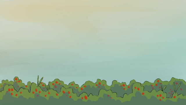
  • For the Studio Brief 2, our studio, Bobcat Studios, decided to produce an animation together for this months' LoopdeLoop challenge, Mushy. The idea of our narrative consists of a character picking strawberries, then finding a mushy, gross one and then discarding it, and then the animation loops.
  • As part of this task, I was assigned to do the backgrounds and help out with some of the animation. Here are the backgrounds I produced:


I additionally explored some possible colour schemes for the website and social media: