Extended Practise
giffgaff Brief Storyboard, Animatic and Character Sheet
giffgaff Brief Storyboard, Animatic and Character Sheet
- This week:
- I produced a rough storyboard, animatic and explored character designs!
- What went well:
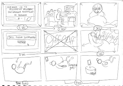
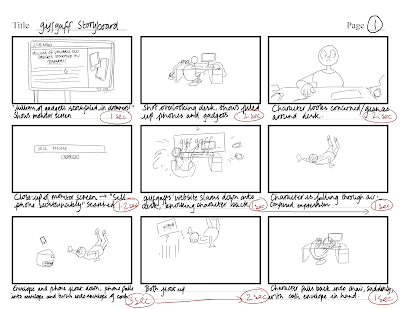
- I was finally able to decide on a story I wanted to follow, which was the idea of the character falling and the phone being packaged up. I had an idea to use the giffgaff Noise Texture in the background of this, to imply the connection between the customer and giffgaff, via online. Through these visuals, it can also imply the simplicity of recycling your old phones, which is something giffgaff wanted as part of their brief.
- I found that drawing the storyboards up roughly on paper was much quicker and easier, as I could cross out shots I might not like and see the story play-out on paper. I think this improved the visual storytelling much more than going straight onto a storyboard sheet.
- Here are the initial storyboards I explored:
Digital Storyboard:
- This translated well into an animatic! Although storyboarding and animatics aren't my specialist focus, I think I was able to produce a well illustrated story, which clearly indicates the character movement and timing. I found it particularly useful to look at LinkedIn Learning Courses, to understand the process a little bit better. On there, , which I followed before making the animatic. It also works perfectly with the 20 second time-limit for the advert, thus fitting within the brief restrictions.
- Along-side the storyboard and animatic, I explored a variety of ideas for potential characters. To make the pacing and timing feel better for a 20 second advert, I wanted to stick to just one character, who tells the story through their actions. The character design was the most difficult part as I wanted the character to feel relevant and relatable, but I needed to consider simplicity for animating and giffgaffs' colour scheme.
- I greatly improved on my initial designs, as the final character sheet is much more fluid. I think the idea of her wearing Pyjamas works for the brief, again to emphasize the simplicity of recycling your phone from the comfort of your home.
- Here are the final developments and design:
- I took these and further simplified them:
- What could be improved:
- I still don't feel 100 per cent happy with the final character design, as I felt I could have made them more unique, if I could explore more concepts. Unfortunately, because of time, I wanted to focus more on the animation side, so I would have spent more time developing if I was less focused on the animation.
- There could have been better ways to indicate the environmental and eco-friendly part of the campaign, however giffgaff noted that they didn't want force this idea of being environmentally friendly onto their audience. They just wanted to show how easy it is to do and the benefits of doing so (earning money), but with the added bonus of environmentally friendly. I tried to show this with the less cluttered desk and cleanliness of their home environment at the end. There might have been easier or more helpful ways of doing this if further explored and analysed.
- Next week:
- Ill be concepting colour schemes and ideas and starting animation!


No comments:
Post a Comment