Saturday, 16 January 2021

Extended Practise: Aviation Aggravation Further Concepts

 Extended Practise
Aviation Aggravation Further Concepts


  • This week:
    • I worked on further character concepts and exploration for Aviation Aggravation
  • What went well:
    • I created some character sketches for Geoffrey and the Air Hostess to get a better feel of the characters, before I start animating them. I also wanted to experiment a little bit the style and shading. I think this helped a lot with establishing the style and how I would like the outcome to look like.
    • Here are the quick sketches of the characters and environments:

    • Here are some quick rendered concepts of the Air Hostess and Geoffrey:


  • What could be improved:
    • I need to establish what kind of textured brush we will be using and additionally, the animation style needs to considered. I need to think about how much "squash and stretch" will be applied to this world and how the characters might interact together. This could be established in the storyboard or further testing.
    • The softer shading used on the characters might be tricky in Toom Boom Harmony, so this is something I may need further research on to see what it could look like.
    • I will not be producing more concepts for the background, as I would like to focus on the characters and animation, therefore I would like Joseph to continue with the concept for the backgrounds.
  • Next week:
    • I will be continuing the Pre-Production for Aviation Aggravation.

Thursday, 14 January 2021

Extended Practise: Final Film Turnarounds and Model Sheets

 Extended Practise
Final Film Main Character Turnarounds and Model Sheets


  • This week:
    • I continued working on the main character turnarounds and began working on model sheets.
  • What went well:
    • After talking with my group and getting general feedback from Mat, the turnarounds were completed. The colour for the Goose turnaround was finalised, and the group approved of the final colours, as they were simpler and Joseph found that they work really well with the current background colour tests. We wanted the colours to be a little darker and muted, in contrast to the other characters, as this reflects his personality.
    • Here is the final turnaround:

    • When exploring the model sheets, I tried to keep the poses simple, but enough to express the character personality. The model sheet also acted as a great test for pushing the body movements and testing the malleability of the characters. 
    • Here are the final model sheets:


  • What could be improved:
    • I need to consider and experiment with the line styles. This is something that Mat brought up in feedback, as I wanted to use a sketchy line style. I will need to look at and explore the vector brushes in Toon Boom Harmony, which have the rough texture. I would like to make the style more fluid and lose, so this is something I'll need to explore.
    • I think that the model sheet poses could be more fluid and exaggerated. This could be developed possibly by exploring facial expressions, from the storyboards.
  • Next time:
    • I will be working on the animatic, from the storyboard Axel created.


Tuesday, 12 January 2021

Extended Practise: Final Film Character Turnarounds

 Extended Practise
Final Film Main Character Turnarounds


  • This week:
    • I continued working on the main character turnarounds and visual development.
  • What went well:
    • After reviewing the drafted turnaround of the Goose and getting feedback from my group, I found that the overall shape of the character was too wide. Reid noted that they found the “tear-drop” shape of the character better, therefore I changed this when I refined the character.
    • I believe that this shape works better for the character, as the rounder shape felt a little more stiff. Here are the changes:
Turnaround Before:

Adjusted body shape and neck:


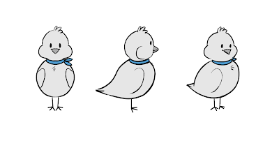
    • After this, I worked on the turnaround for the Air Hostess and we had decided on the design with the puffed cheeks and small body. I believe this design will work really well for animating, because of its’ simplicity. It is also based upon the bird design I made for Mimo, for COP, which means that I already have the knowledge for animating them - which saves a lot of time.
    • Here is the turnaround:


    • When thinking about the colour, I tried two colour designs for the Goose, as these were the two most popular colour styles I was seeing in my research. I will be sending these designs to my group to have a look over and decide which is best and whether it needs adjustments.


  • What could be improved:
    • We discussed the possibly of slightly adjusting the Air Hostess design, as we felt her silhouette was a little too similar to that of the Goose. Therefore, next time I work on them, I'll adjust her design.
    • We also discussed that the Goose design needs the colours simplifying, however the brown palette works best. This is an additional thing I will be adjusting, by reducing the amount of colours used and testing to see if they fit well with the backgrounds.
  • Next time:
    • I'll be finalising the turnarounds and starting model sheets.

Sunday, 10 January 2021

Extended Practise: Giffgaff Brief - Editing

 Extended Practise
giffgaff Brief - Final colour and editing


  • This week:
    • Joseph assisted with the colouring and compositing for the giffgaff brief.
  • What went well:
    • We were able to finish colouring the full 20 second advert and add the backgrounds, which really brought everything together. 
    • Overall, the character fits well with the background, the line style works for giffgaff's brief guidelines and the story of "Sell your old phone, get cash" which giffgaff wants to tell, shows through very easily. The colours work well together and the blue and orange-ish yellow compliment each other quite well. 
    • During the editing process, Joseph added a soundtrack and some effects which bring the animation much more to life. I believe that we followed the brief accurately for the 20 second ad and utilised all the research for giffgaff's previous ad campaigns. We were also very risk-taking with the process, as I decided to do a frame by frame animation, which is something giffgaff have never done before. 
    • Here is the final edit:


    • During the final editing, we also created a series of Digital Ad Banners and Joseph worked on an Instagram story post of the character falling in an endless loop. I found this article which explains the sizing for banners, which I referred to when editing them.

    • We had a lot of technical issues with the colours, as the colour HEXs and RGB codes provided by giffgaff didn't produce the same colour, depending on the code you used. We also found that we forgot to consider the 4 primary colour limit, plus black, white and skin colour, which meant we had to re-colour the pinks used, to blue, to keep to their 3 primary colour limit.
    • Here's what this looked like before:


    • I created 5 animated ads, as when looking at their Twitter pages and other digital advertisements, the ones which were animated are most appealing. The idea that they are digital, also, allows the freedom to be either animated or still. Therefore, I wanted to give more animated advertisements, which can also work as still frames. Here are each of the edited ads I created:


    • Here is Josephs' Instagram loop, which we will also be submitting:


  • What could be improved:
    • I believe that the animation of the character could have been more consistent and that I could have kept more on-model when animating. Additionally, we might have benefitted more from exploring more character ideas, before, as we settled on a character quite quickly.
    • Furthermore, whilst the storytelling works well, I think it could have been better with more idea exploration and refining, despite the difficulty of trying to get the animation to be under 20 seconds. This could have been done with idea generating and maybe testing animatics to see which works.
  • Next week:
    • We will be submitting the final animation and set of digital advertisements to the D&AD Competition.


Saturday, 9 January 2021

Professional Practise 3: Review Your Presence

 Professional Practise 3
Study Task 1: Review Your Presence


  • This week:
    • I considered my online presence, my current skills and what I need to do to improve in the future.
  • What I found:
    • My specialism in Animation is 2D Animation and Illustration (Concept and Design). I enjoy 2D Animation the most, because I find it the most rewarding when I am able to make something move believably and bring it to life. Also, a lot of my inspirations are 2D Animators. 
    • Despite having used TVPaint, Adobe Animate and software such as Paint and Windows Movie Maker, in the past, I find that Toom Boom Harmony is the best software for my skills and is also industry-standard software. I understand a lot of the interface for Toon Boom, but I would like to understand more short-cuts and industry skills in the future.
    • I use a screen tablet (XP-Pen) for animating, as I find my workflow to be much quicker than using that of a desk graphics tablet.
    • I have several things I would like to do, once I finish the course. I would like to travel, or try get a job in a studio. I wouldn't mind taking up freelance animation either, therefore I need to review my online presence a lot more.

  • My Online Presence:
    • I need to review my online presence. I would like to take a different approach to social media, such as changing my brand name - as it still has ties to older accounts, which aren't as professional. I would like to only use Instagram and YouTube, possibly Twitch. I would need to rebrand my current YouTube account if I were to start posting there again. 
    • I've considered changing my online brand name to "Alinaydra" from "Faye Scribbles", as it is a less specific name to art, it would fit a particular branding theme and style I'd like to go for. This is something I will consider with my new art account on Instagram.
    • I think that my old showreel still reflects the style and genre of 2D Animation I would like to try, however it will need updating with the newest work I have completed, as I have since improved greatly from older work!

  • Portfolio:
    • After a portfolio review from Head of 2D Animation at Brown Bag Films, Erica Lack, I noticed that she only viewed my showreel on the first page of my portfolio. She also gave me advice on how to improve my showreel, such as only including fully rendered animations, as they stand out.
    • Here is the email screenshot of our planned meeting time:


    • Here are notes I made during the meeting:


  • How will I improve going forwards:
    • I need to update my CV and Showreel and start producing business cards.
    • I need to update my online social media presence and start posting art and animations more frequently, engaging more with my audience.
    • I need to update my portfolio: https://alishafayelittle.wixsite.com/portfolio


Friday, 8 January 2021

Extended Practise: Final Film Character Refinement and Exploration

 Extended Practise
Final Film Further Character Exploration


  • This week:
    • I explored possible designs for the main character and side characters of my short film.
  • What went well:
    • To finalise the Goose character, I put together a comparison sheet, which compares the two designs which the group and I had decided on, before. I found that the added dynamic pose really helped solidifying the decision of which face shape would be best to use. 
    • I additionally gave him a laptop bag, to add more to his character and it felt logical, as he pulls out a laptop whilst on the plane. 
    • Here is the comparison sheet:

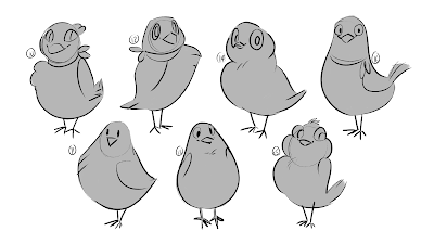
    • I additionally started on the exploration for the Air Hostess character. Using Reid's designs of the bird in their storyboarding, I explored several design concepts. I tried to keep to a smaller and stumpy shape, similar to that of Mimo from my Context of Practise module, as I already had knowledge in animating that body shape. 
    • Here is my initial visual inspiration page:

    • I produced two pages of shapes and poses, to-which I asked my group again for feedback. They liked poses/designs 2, 3, 7, 10, 15 and 16 the most. I was able to then take these designs and try to come up with a final four designs for them to choose from. They particularly liked the designs with the feather tufts on the chest and the chubby cheeks. 


    • With these designs I believe that I was able to capture the personality and appeal of the Dove Air Hostess. I wanted to portray a friendliness and enthusiasm, almost acting as a contrast to the personality and expressions of Goose.
  • What could be improved:
    • The design for Goose still needs a turnaround and model sheet produced. I started to draw out the roughs for the turnaround, however after feedback, I felt that the body felt too large in comparison to how I was drawing him before. I also need to make the neck slightly longer, as it loses the "goose-neck" he had before. This is something I will work on over this week.
    • Furthermore, a final design needs to be settled upon for the Air Hostess, as her shape needs to fit right with her character. I will continuing with this, this week, by getting more feedback from peers and correcting her shape to fit feedback.
    • I did tend to stick towards a specific shape when designing the Dove, as I leaned more towards a rounded, soft shape. I think in the future, I should be more experimental with body shapes to really explore character silhouette. This is something I will consider with future designs and projects.
  • Next time:
    • I will be finalising the turnarounds and  main character concepts.


Monday, 4 January 2021

Extended Practise: Final Film Character Exploration

 Extended Practise
Final Film Character Exploration


  • This week:
    • I explored possible designs for the main character of my short film.
  • What went well:
    • I started by creating a visual board for bird characters in media, specifically geese and ducks. I found this particularly useful when designing characters, as I had initially struggled to stylise Geese. It also gave inspiration for designs that are much more simplified and those that are more complicated, allowing the character design process to be fully explored. 
    • Here is the visual board:

    • I kept my initial designs very lose and experimental. I didn't have a particular style in mind, other than something that could be animated quite easily. I found that my first page of designs were quite varied and allowed for a lot of further refinement.

    • I sent this to my group for feedback. Some things they noted were:
      • As a majority, designs 1, 2 and 4 were favourites, as they felt this looked more like a goose and had a better balance in design.
      • The floating eyebrows of design 5 were also appealing to them.
      • They found the larger, bushier eyebrows more fitting for the character.
      • They preferred webbed feet, over the smaller feet.
    • Taking on board this feedback, I made another page of designs, with some variation. Some designs took on board their feedback, such as the thicker brows and webbed feet.

    • Of these designs, I found numbers 12, 15 and 16 most appealing, although I did consider number 14, also. From feedback, my group believed that 15 and 16 were the most fitting. Despite their similarities, their face features are different, so I drew them side by side in similar poses to compare.

  • What could be improved:
    • Taking on-board the feedback previously given for the designs, I need to refine these final two further or find a compromise which balances them both. 
    • The designs also need to be considered for animation purposes and whether they could be simplified further or could be more detailed, depending on feedback and how I choose to finalise them. This will be through more experimentation and adjusting poses.
    • I also need to consider whether the character's design fits the personality and the world, which will be discussed alongside the storyboard, script and background designs.
  • Next time:
    • I will be refining these designs and starting concepts for the Air Hostesses and background characters.