Process and Production
Study Task 7: Pitch Bible
For the Pitch Bible, I first looked at other Pitch Bibles created by other artists and creators, such as the pitch for Spongebob Squarepants and Adventure Time. They helped me develop a consistent, yet interesting pitch of both my characters and ideas.
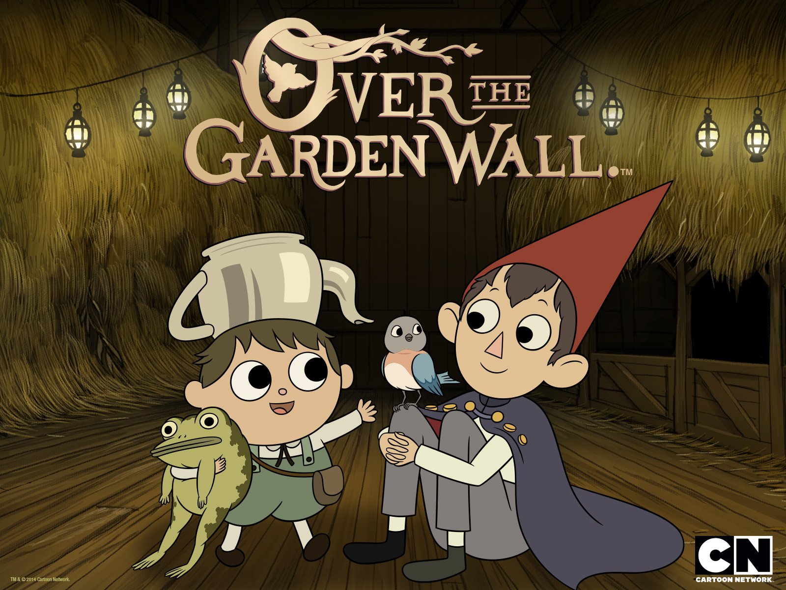
As the Pitch Bible was tasked for the following day, I had one evening to pull together a collection of images I had created, which fit well in the presentation and Cover Art, with the title. At this point, I had not decided on a title for my animation, however, as I was further developing the world, I settled with "The Lost Scrolls of Ruklore". For my Cover Art, I looked at a variety of cover art for other shows, such as Steven Universe, Gravity Falls and Over the Garden Wall, as inspiration.


Unfortunately, the cover art isn't as refined as what I wanted it to be, however I like the sketchy aesthetic, so I have decided to try incorporate this in my work.
Animation World Network Blog also has a post on creating successful Pitches, which I used some ideas from: https://www.awn.com/animationworld/pitch-bible-just-essentials
Feedback
The feedback I received on my Pitch Bible was overall positive. I was complimented on the designs and weight of the characters and also the concepts for the backgrounds. The idea of using more of a painted style for the backgrounds seemed to work better and leaving the characters to stand out more, with the lined work. Through looking at other Pitch Bibles, I noted to use text fonts which matched the overall aesthetic of the animation and layouts which suited the theme, also. I did this within my presentation, using a brush font, as though it would have been hand-written on parchment paper.
I was told that the story and storyboard worked fine, however I needed to include more visuals indicating Sumac's presence in the animation. I would be doing this through the colour of his eyes, glowing behind her. I would also make him visually stand out more, against the background of the castle walls. I will also explore possibly updating the storyboard to introduce his character.

No comments:
Post a Comment