Thursday 28 February 2019

Context of Practise 1: Visual Journal

Context of Practise 1
The Uncanny Valley Visual Exploration

After watching a video explanation on the Uncanny Valley, by Extra Credits (2012), I would like to explore the differences in photorealistic representations of characters and environments, as a comparison to stylistic ideas. They explore this in context of gaming and film, therefore I wanted to utilise these ideas to filter into my visual journal. 


https://www.youtube.com/watch?v=9K1Kd9mZL8g

The way in-which this could be drawn is through creating characters which, in terms of visual design, begin with realistic elements, before becoming further developed into a new creature or idea. This could then be explored in how it could translate into CGI, or would remain in 2D traditional media and would further improve my visual ideas.

Tuesday 26 February 2019

Process and Production: 2D Walk Cycles

Process and Production
2D Walk Cycles

To practise using TV Paint and producing 2D Walk Cycles, I decided to create a walk cycle for Sumac. I found it easier working in TV Paint, however the line-work could have been more consistent I need to understand how to colour in TV Paint more, and shade. When I had finished the walk cycle, using the same book references I used for the previous one with The Animators Survival Kit by Richard Williams. I additionally used a TV Paint user guide to help me navigate through the software, which can be found here:


This is the lined walk cycle:


In order to make the line work visible after I coloured, I duplicated the initial line work layer, so that it would still be smooth and clean lines, despite the colouring. I still need to understand the colouring process in TV Paint. I additionally feel that the feet could be more consistent, however I think I did well with the tail swing and head-bop.

Once I finished the walk, I imported it into Photoshop and added a fire-glow to his eyes and a red overlay, to represent his character more.


Monday 25 February 2019

Process and Production: Animatic and Soundscaping

Process and Production
Study Task 9: Animatic and Soundscaping

When compiling my storyboard together to produce an animatic, I added additional keyframes in Photoshop, to start to map out the animation process. I drew over the storyboard images and adjusted them to be more fleshed out, then exported the animatic to apply sound, using Premiere. 

When creating my animatic, I looked at a variety of others and it allowed me to understand that they don't need to be too refined yet. Some of those were fan-animatics on Youtube and Disney ones, such as Mulan and Coco.


I think that the animatic moves and can be easily understood, however I think towards the end of the clip, more keyframes may need to be added to fully understand the transitions and movement between frames. I will also have to watch and be sure to how consistent I keep my characters, as they aren't as consistent in the animatic.

Here is the version with sound effects


Process and Production: Working with Maya

Process and Production
Follow-Through and Key Frames in Maya


To further understand key-frames and how to animate a follow-through and overlapping animation in Maya, we used the rig "Tailor", with boxes to make them move in the scene. I think that I timed the movement well, however, I could have changed the squash and stretch to be further exaggerated. I think the movements could also be more clean and consistent, such as towards the end. The beginning few frames don't seem right, in contrast.

It was also frustrating when Maya crashes, as I lose focus and therefore the animation loses consistency. This is something I will focus on next time and further understand the graph editor.


Sunday 24 February 2019

Process and Production: 2D and 3D Walk Cycles

Process and Production
Study Task 8 - Walk Cycles 2D, 3D and Beyond


For the 3D Walk-Cycle, I decided to redo the Stop-Motion walk-cycle I created with my Puppet. I wanted to fix some of the errors I had made before and therefore, added more of a "toe flick" on the second step and also added additional frames to make the movement smoother. I wanted to fix the arm swing, however I felt this could have been done better, as the hands still stutter slightly. To help with the movements of the Walk Cycle, I used The Animators Survival Kit, in order to understand the movements.

First Attempt, from previous task

Second Attempt for Study Task 8

I imported the frames into Photoshop and made the background transparent and added a small shadow. After this was rendered, I added some additional motion effects, by drawing over the frames on the hands and feet, with a textured brush.


Doing so added more motion to the walk cycle.


For the 2D Digital Walk Cycle, I started by doing a test in Photoshop, however this didn't go as I wanted it to, as the proportions of Mearas' figure changed and flickered, so I decided to start this again. 


I did the initial sketch of the walk in TV Paint. I used The Animators Survival Kit, by Richard Williams to help with the timing of the frames and positioning of the arms in relation to the legs. 


In the redo, I think the proportions work better and remain consistent with her walk style. I think this could be further improved with more exaggeration and consistency of the hair movement, which I will aim to focus on in the walk cycle I create for the animated short.

Thursday 21 February 2019

Context of Practice 1: Ways of Thinking

Context of Practice 1
Study Task 5: Ways of Thinking

After being divided into groups to explore "Lateral Thinking" as a way of exploring ideas, we decided to research the definition of Lateral Thinking and used the book Lateral Thinking by Bono, E.D. to refine our research. The book gave a clear explanation of the process, in comparison to Vertical Thinking.

As a group, we decided a creative way to show the process of both Lateral and Vertical thinking, was to create a series of character designs based on the same concept, "Fire Character". We initially started with Vertically thinking, as a group, which created quite a linear character. Then, we used Lateral thinking and found the process much easier in developing a wide range of character designs, based from one concept. 

I think the process could've been illustrated and demonstrated better, by using both vertical and lateral thinking individually and as a group, however, I believe that we illustrated the process in a creative way. We all worked as a team to produce the presentation. I think more research could have been included to further improve the explanations.


As an improvement of our presentation, we were told to add more detail about the task we set ourselves and a final graph to demonstrate our "lateral thinking" as a visual process. As a group, we were praised for approaching the task in a creative way and visually exploring the thought process.

Tuesday 19 February 2019

Process and Production: Stop-Motion Walk Cycle

Process and Production
Study Task 6: Walk Cycle

When making the stop-motion puppet walk cycle, I encountered problems such as the tearing of the plasticine, restrictions in the movement of the arms and legs and also problems with trying to make the puppet stand properly. I think I was able to make the walk-cycle work, such as with the flick of the ankle upwards on the first motion and having the arms move opposite to the legs.


The feedback I received on the stop-motion animated walk-cycle, I was told to make the leg kick up on the second step, because she appears the slide, when the ankle flicks up. That's something I need to change when I make improvements to the walk, next time.

Monday 18 February 2019

Process and Production: Background Design

Process and Production
Creating Backgrounds and Concepts

In order to create the right perspectives for backgrounds, I created a scene in Maya using the simple polygon shapes and then rendered the image to assist with backgrounds. 


I visited both Sandal Castle and Pontefract Castle in order to gather reference imagery for potential castles and landscapes, when designing the castle. I additionally looked at the book, Digital Painting Techniques, Volume 1, by 3Dtotal.com, which explores how to create your own custom brushes in Photoshop and explores values. I implemented this within designing my backgrounds. 


I made minor adjustments when the painting was complete, such as moving the horizon up slightly, to create more visual interest and adjusting some of the colours, using Image > Adjustments > Curves.


Process and Production: Maya Animations

Process and Production
Maya Animation Practice

In the Maya lesson, I created a variety of animations using the assets given to us. Using the canon and ball in the scene, I first made a "realistic" animation, where there is stiffer movements and less squash and stretch of the ball, as it hits the wall and lands. This adds weight to the ball.


I, then, produced a version which uses squash and stretch, easing, arcs, overlapping actions, as part of the principles of animation.


To further practise animation in Maya and the use of the graph editor, I created a bouncing ball animation, using the same idea as the initial canon-ball, to practice using the software.
I reworked the bouncing ball animation twice, however I feel the movement of the ball and spacing could be further improved at the end of the bounce, as it feels choppy.


Context of Practice 1: Feedback

Context of Practice 1
Essay Feedback

After having submitted my essay and had my visual journal reviewed, I found that my essay had several improvements to be made. These consisted of inconsistencies with the references, some grammar and phrasing mistakes and some additional changes needing to be made in my evaluation. As my next steps I will explore the Uncanny Valley in my visual journal to tie back with my research and correct the essay mistakes.

Professional Practise 1: Advertising in Animation

Professional Practise 1
Advertising with Animation

To further explore advertising in Animation, I decided to look at how it has been used through history and additionally, explore more areas in-which advertising has been made using animation. Using the books, Animation: A World History, volume 1 by Giannaberto Bendazzi and Animation: A Global History by M. Furniss, I was able to find further sources of information.

  • The Marlboro Cigarettes rebranding in the 1950s was one of the breaking ideas for advertising.
    • The public and clients liked the use of animation in advertising, as it allowed advertisers to sell their products without being too forward or forceful and it produced a memorable story or ideology, making brands have a more positive reaction from audiences.

  • Animated characters allowed for merchandise, from popular icons, such as Tony the Tiger. The characters had the benefit of not ageing, because of the medium used.


Stop-Motion Advertising


Philips Broadcast of 1938
https://www.cartoonbrew.com/classic/philips-revue-of-1938-by-george-pal-8387.html

  • Hungarian, George Pal produced the stop-motion advertisement Philips Broadcast of 1938, which is described to be fun, colourful and stylish. It appears experimental for an advert, despite how long ago it was produced.


Saturday 16 February 2019

Process and Production: Analogue Character Modelling and Realisation

Process and Production
Study Task 6: Analogue Character Modelling and Realisation

To create the puppet of my protagonist, I printed a 20cm high copy from the T-Pose sheet and began making the wire frame. I had to make some adjustments to the neck and shoulders, for the movement to work, however, this worked in my favour when the form was built up. 


As my character is small and slim, I had to use Epoxy to sculpt out the "bones" of the limbs, such as on the arms and legs. I only needed a small amount of blue foam in order to build the chest and head, as I wanted to allow more movement of the character overall. Once the Epoxy had dried and the foam was glued in place, with a hot glue gun, I was able to make the hands. I think I had cut the wire a little bit too short, so the fingers were un-even and some were far too short than others. I, then, used bandages and self-adhesive bandages to mould out the character ready for plasticine moulding.


After this, I was able to start moulding with Plasticine. I had taken a small chunk home to manipulate and understand how I was going to mould her clothes and body. I started by colour mixing, to get every tone I needed for the hair, skin and clothes, then began with the skin tones.

I found it easy to wrap the arms and legs and torso, more than the hands, as the hands were small and I should've bandaged them more to prevent the wires poking through. I thought the scarf was one of the best clothing items I made, because I was able to re-create the folds and tears. The process of making the face was the most difficult, because of how small she is. The first attempt didn't go correctly, so with advice, I made improvements.


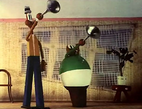
Here is the completed model:


I think that next time I'll make the body larger, so I can include further detail and also try to smooth the Plasticine more, especially on the face. I believe that I managed to replicate her reference well and recreate the colours.


Tuesday 12 February 2019

Process and Production: Pitch Bible

Process and Production
Study Task 7: Pitch Bible

For the Pitch Bible, I first looked at other Pitch Bibles created by other artists and creators, such as the pitch for Spongebob Squarepants and Adventure Time. They helped me develop a consistent, yet interesting pitch of both my characters and ideas.

As the Pitch Bible was tasked for the following day, I had one evening to pull together a collection of images I had created, which fit well in the presentation and Cover Art, with the title. At this point, I had not decided on a title for my animation, however, as I was further developing the world, I settled with "The Lost Scrolls of Ruklore". For my Cover Art, I looked at a variety of cover art for other shows, such as Steven Universe, Gravity Falls and Over the Garden Wall, as inspiration.

Image result for cover art for steven universeImage result for over the garden wallImage result for gravity falls cover art


Unfortunately, the cover art isn't as refined as what I wanted it to be, however I like the sketchy aesthetic, so I have decided to try incorporate this in my work.


Animation World Network Blog also has a post on creating successful Pitches, which I used some ideas from: https://www.awn.com/animationworld/pitch-bible-just-essentials

Feedback

The feedback I received on my Pitch Bible was overall positive. I was complimented on the designs and weight of the characters and also the concepts for the backgrounds. The idea of using more of a painted style for the backgrounds seemed to work better and leaving the characters to stand out more, with the lined work. Through looking at other Pitch Bibles, I noted to use text fonts which matched the overall aesthetic of the animation and layouts which suited the theme, also. I did this within my presentation, using a brush font, as though it would have been hand-written on parchment paper.

I was told that the story and storyboard worked fine, however I needed to include more visuals indicating Sumac's presence in the animation. I would be doing this through the colour of his eyes, glowing behind her. I would also make him visually stand out more, against the background of the castle walls. I will also explore possibly updating the storyboard to introduce his character.


Context of Practise: Visual Journal Development

Context of Practise
Visual Journal Development

To develop my visual ideas, when exploring character design in relation to how it could be stylistically adapted in CG Animation, I decided to explore concept art and how this differed from the final outcome. The concept art I looked at was Harry Potter and the Prisoner of Azkaban and concept work for Kung Fu Panda 2.


When exploring character design for Harry Potter, the character concept art has remained very similar to the final outcome. Earlier in my sketchbook, I explore detail in character design, such as developing one character, by adding further detail, then exploring it in a stylised way.

Whereas, in the Kung Fu Panda 2 visual development, a lot of the focus is on the colour and composition, rather than the characters' appeal.


My visual journal ideas has lead me to explore both of these concepts.

Saturday 9 February 2019

Professional Practice 1: Disseminate Evaluation

Professional Practice 1
Disseminate Evaluation

Overall, my first presentation to the group was successful and I think that I was well-prepared and able to speak loudly and clearly about the game Cuphead. I found that sometimes I did repeat myself and stutter through the presentation, however I was praised on the fact that my presentation only included images, which were used to reinforce what I was speaking.

I felt that in some places, some text would have been helpful on the slides, to aid with what I was saying, but only as short titles. Some further images could have also been used on each slide, rather than just one, but it helped keep the presentation simple. 


Friday 8 February 2019

Process and Production: Further Character Sheets

Process and Production
Further Character Design and Development Sheets

In order to improve on my previous model sheet, I decided to produce an additional one, whilst also focusing on expression and consistency. The sketches were initially done in my sketchbook, before being scanned into Photoshop and used as reference, before I began lining. To improve on my anatomy, I used the website Line-of-Action.com in order to help solidify my poses, whilst also remaining fluent.

I wanted to also explore change in the characters' design based on environment factors, thus I focused on the hair. This was used to look at several hair-styles and also how the hair and clothes would change when damp. I found it was fun to explore this and it made the character feel more believable.

I think this model sheet is more refined than the previous one, however I still need to work on my anatomy and shape of the character. I attempted exaggerating expression with the middle face, however the jaw isn't anatomically correct and needs moving slightly. I will focus on this next time.
Model Sheet 2


Model Sheet 1


I created a further character sheet, with logo and a short tagline for both my protagonist and antagonist. It uses a line-less style, similar to the concept environments I created.


Context of Practise 1: Visual Journal

Context of Practise 1
Textures and Backgrounds

When exploring CGI textures and backgrounds, I rewatched Avatar in order to gather a full understanding of how James Cameron went about creating fantasy worlds. He incorporated bright colours and plants and a variety of textures within his background and world creation. When further researching this, I discovered that he also used a virtual camera to edit the landscape as the actors moved around the scene.


Similarly to Avatar, Harry Potter utilises CGI animals and creatures, incorporated into the CG world, rather than using puppets. I would like to explore both of these concepts in my visual journal analysis.

Wednesday 6 February 2019

Professional Practise 1: Disseminate Presentation

Professional Practise 1
Disseminate Presentation

I opted to make my presentation more visual and try to use a limited amount of notes, in order to make the presentation more fluent. I think that I could have included more images, though in the presentation and possibly a video-clip containing game-play, however, with the limited time to 5 minutes, I wanted to be as consise as possible. 

Overall, my research process, I felt, was the most successful, because I was able to compile information from a variety of sources and from the developers, themselves. I also played and watched the game to understand the fundamentals and story. I chose to focus on the stylistic choices in Cuphead, as that was what made the game grow in popularity.


(Click settings to open speaker notes!)

Tuesday 5 February 2019

Process and Production: Modelling Skills

Process and Production
Study Task 5 - Modelling Skills


As part of learning how to model in Maya, I first followed the tutorial in order to create a Wooden Truck, using a photo as a reference for my truck. I found the construction of the shapes to make the Truck easier as became quicker at understanding how the software worked and when I had made note of shortcuts. 

One thing I struggled with was adding texture to the model and the lighting. In order to understand this, I watched a series of Youtube videos, such as one explaining texture in more detail:


In addition to this video and the videos posted on Estudio to follow, I also found an Ebook called Getting Started in 3D Maya by Adam Watkins, especially the sections on UVs and UV Layout and explains the concept of shells, which I was able to apply to my Wooden Truck.


To further expand on using Maya, I wanted to explore textures on curved surfaces, so I created a mug, which I would apply a polka dot pattern around it. I learnt that I could change the pattern and the UV style in the menu, changing from a Planar surface to a Spherical surface, so the pattern would mould around the curve. I think that, however this could've been further improved with more accurate modelling skills and understanding creating more detailed and refined shapes. I decided to experiment with the colours and the handle, to create something different from the photo references.


As another simple test, I decided to recreate my mobile phone and add booleans to create the charger port and speakers. The shine of the surface was created using a different material, which is Phong material. The render could've been overall improved by maybe trying to model the case around the phone and adding a logo.